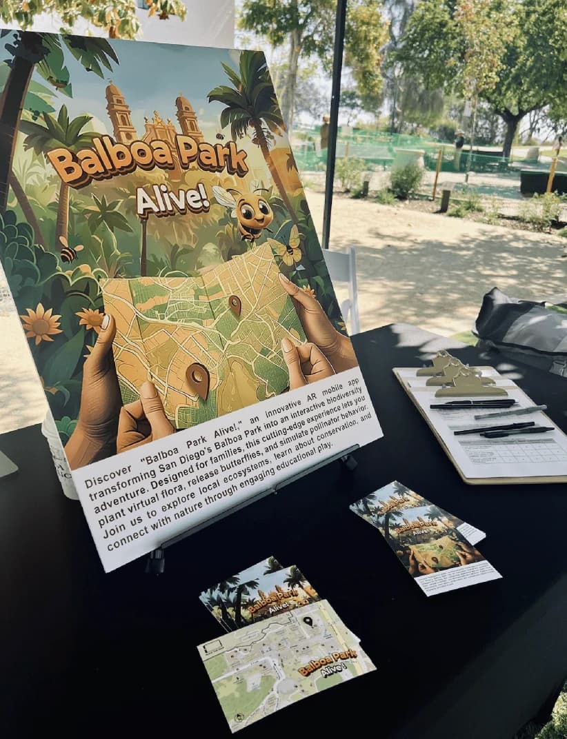
Balboa Park Alive!
Designing an interactive augmented reality app to educate young kids and families about local biodiversity.


Duration
January 2024 - June 2025
Role
Researcher
UX Design
UX Engineering
Client
University of California, San Diego
Funded by Dr. Seuss Foundation
Tools Used
Figma
Unity
Lightship ARDK
Mapbox SDK
MediaPipe Hand Tracking
After Effects
Diffusion Models for Content
Team
Dr. Ying Choon Wu (Research Scientist, UCSD)
Dr. Biayna Bogosian (Co-PI, ASU)
Patrick Coleman (Writer and Creative Developer, UCSD)
Daniel Jalali (Lead Developer)
Jacob Yenney (Developer, UCSD)
Background
Balboa Park Alive! is a series of immersive, interactive phone-based installations that leverage Augmented Reality (AR) to explore biodiversity of San Diego/Tijuana.
This app integrates Niantic Lightship ARDK, Mapbox, and mobile hand tracking to facilitate immersive interactions with 3D digital depictions of the creatures and flora, making this region a leading biodiversity spot on the planet. Distinct from similar conservation-focused mobile AR applications, Balboa Park Alive! places emphasis on first-person experiential learning and research-backed methods of exploration. By using directed motion and visual cues, it encourages families to interact with the environment and bond with each other.
The Situation
Balboa Park Alive! provides location-based experiences to explore biodiversity using AR. I joined the team during the alpha stage, where the app was already functional. After initial testing with a small group of families and young kids in the Balboa Park region, the team found that the app lacked usability, proper flow, and design consistency.
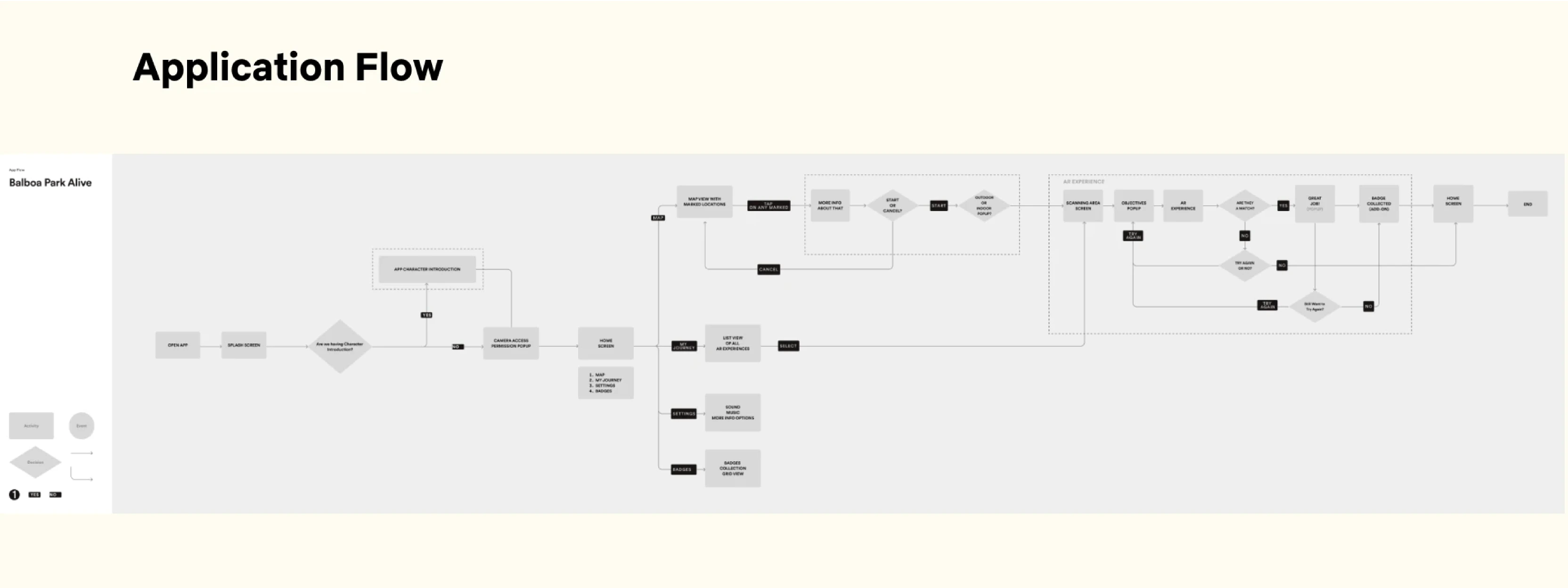
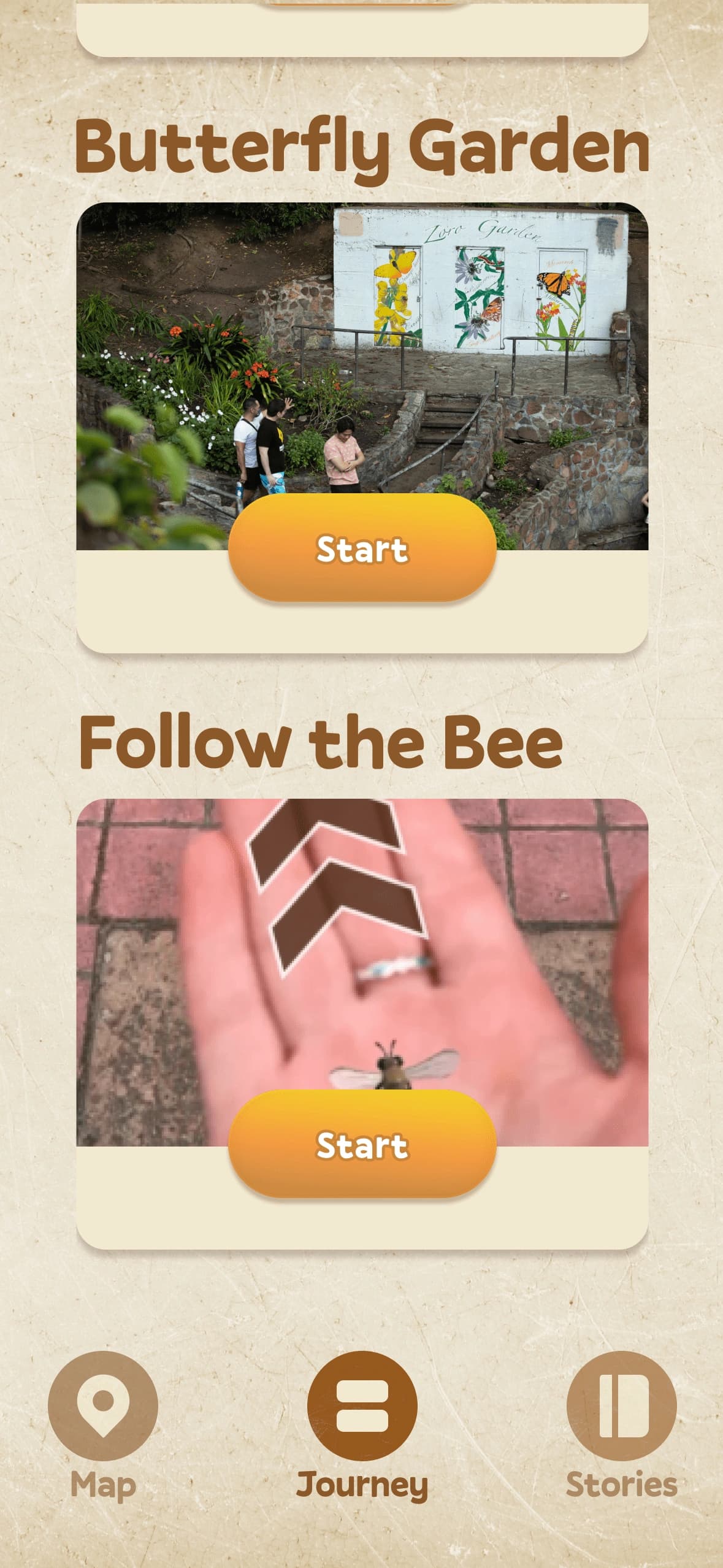
My responsibility was to make the app more usable, functional, and immersive. To do this, I needed to understand all the details thoroughly. I began by exploring various aspects of the app, which can be seen below:
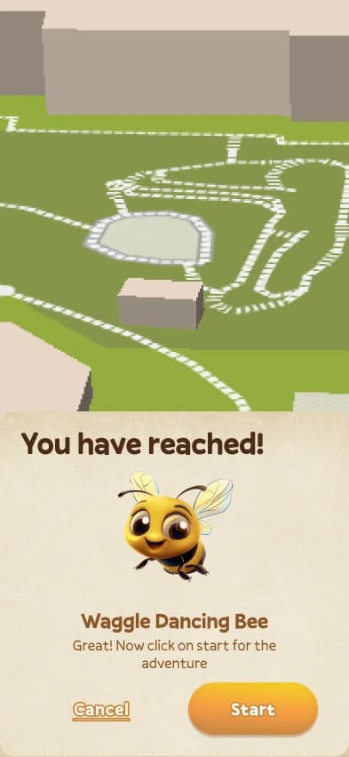
Selecting the AR Experience
• The map displays various location markersthroughout Balboa Park
• Tapping on a marker reveals relevantinformation about that location
• After tapping "Start," the camera opens tobegin the AR experience
Experiencing AR in action
• It prompts the user to plant a seed by swipingup on it
• After planting, it prompts the user to selecta pollinator
• The app then shows if the chosen pollinatoris a match or not
Upon examining their current app, I found myself with numerous questions, two of them were...
How might we create an immersive & interactive experience for young kids?
How might we enable young kids to explore, find and learn more about nature?
Approach
Research

Design Audit

Competitive Analysis

Ethnographic Field Study
Design Audit
I started with a detailed design audit, focusing on four key areas: Service Design, Design Research, UX Design, and Visual Design. My goal was to identify and highlight potential enhancements to optimize the AR experience for children. This included increasing interaction clarity, reinforcing visual feedback, improving accessibility, and integrating gamification elements to create a more engaging and educational user journey.
After dividing the application into different design domains, I gained a comprehensive understanding of its current state. This process helped me identify key insights and pinpoint weak areas that needed improvement. By focusing on Service Design, UX Design, Research, and Visual Design, I could clearly see where enhancements were needed to optimize the AR experience for our users.
Competitive Analysis
After reviewing the current application flow across different design domains, I had a clear understanding of the areas needing improvement. To proceed, I began researching competitors in the learning game industry and analyzing their solutions.
To gain a deeper understanding, I selected two competitors with the same target group, platform, and similar features.I analyzed their strengths, weaknesses, and product strategies by creating screen flows and examining them across the same design domains, articulating how we could improve our own product by learning from their approaches.
Ethnographic Field Study
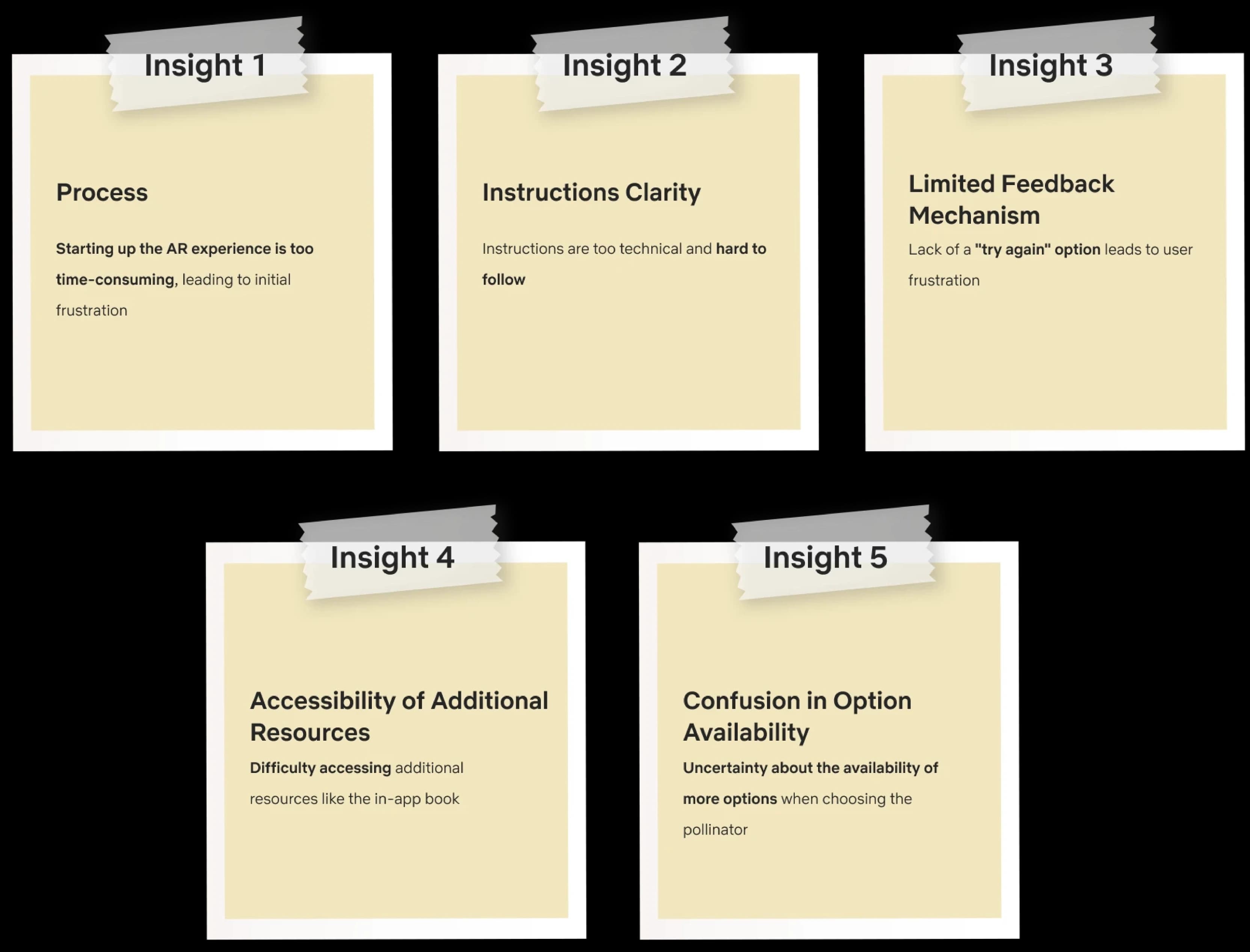
After auditing the current app, I asked my team to help organize an ethnographic field study to observe users in a natural environment. Since this is a location-based experience, we set up in Balboa Park and spent time watching families and young kids as they launched the location-based AR experiences. This allowed us to see the challenges and frustrations encountered in real-time, providing valuable context for our research. To gather more insights, we interviewed a few parents and their kids, asking about their opinions, experiences with the current product, and ideas for improvement.
Study performed in the Balboa Park Region
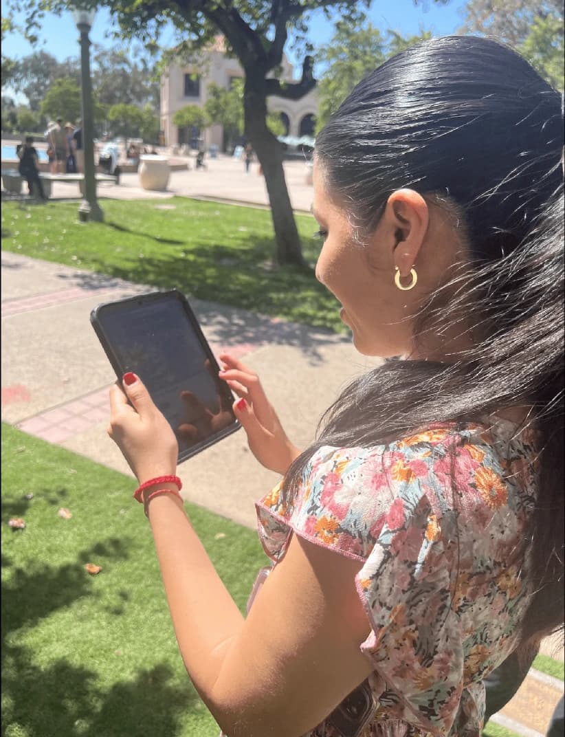
Observing users in natural environment
Analysis
To gain a deeper understanding, I selected two competitors with the same target group, platform, and similar features. I analyzed their strengths, weaknesses, and product strategies by creating screen flows and examining them across the same design domains, articulating how we could improve our own product by learning from their approaches.
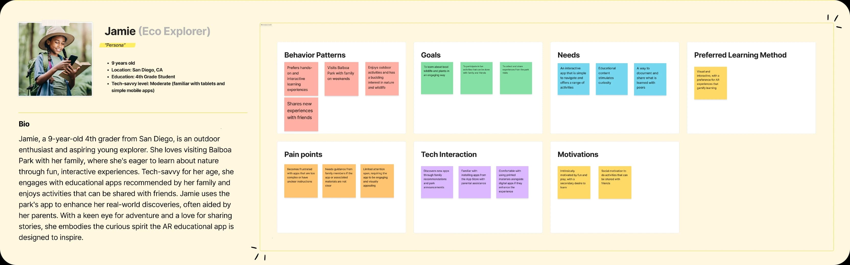
Persona
Based on our insights and observations from the research methods, I created a persona that captured the essence of our users and their characteristics. I also formulated behavior patterns, tech interactions, learning methods to understand more.
Cognitive Task Analysis & Journey Map
I created an outline for Cognitive Task Analysis (CTA). CTA was essential for breaking down the steps and identifying critical pain points, which informed how the UI could be more intuitive and engaging. It highlighted the need for clear guidance and feedback throughout the AR experience to keep young users engaged and reduce frustration.

Design
Information Architecture
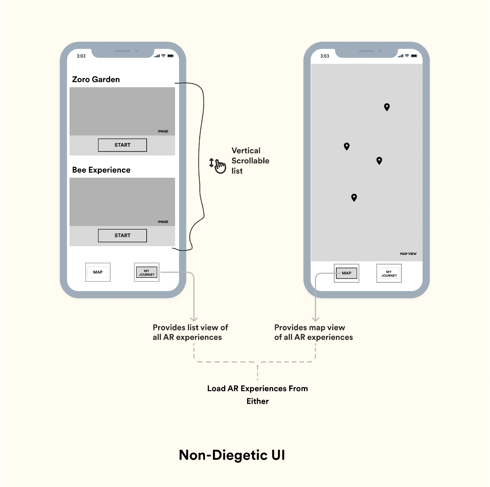
The app will consist of two main tabs: Map and My Journey. They contain the primary functionalities of the app.
To ensure the application is easy to use, I began by designing the application flow. Based on previous research, I knew our users are impatient and prefer fewer steps. This led me to reduce the number of screens from four to just one by adding a 'My Journey' tab to the 'Map' tab. This tab contains the same information in a list view format, making it a one-click experience.
After getting clarity with the information architecture, I was ready to move on to designing the user interface for the app. But before diving into sketches, I researched various types of Game UI layouts and explored which type of layout is used for specific information.
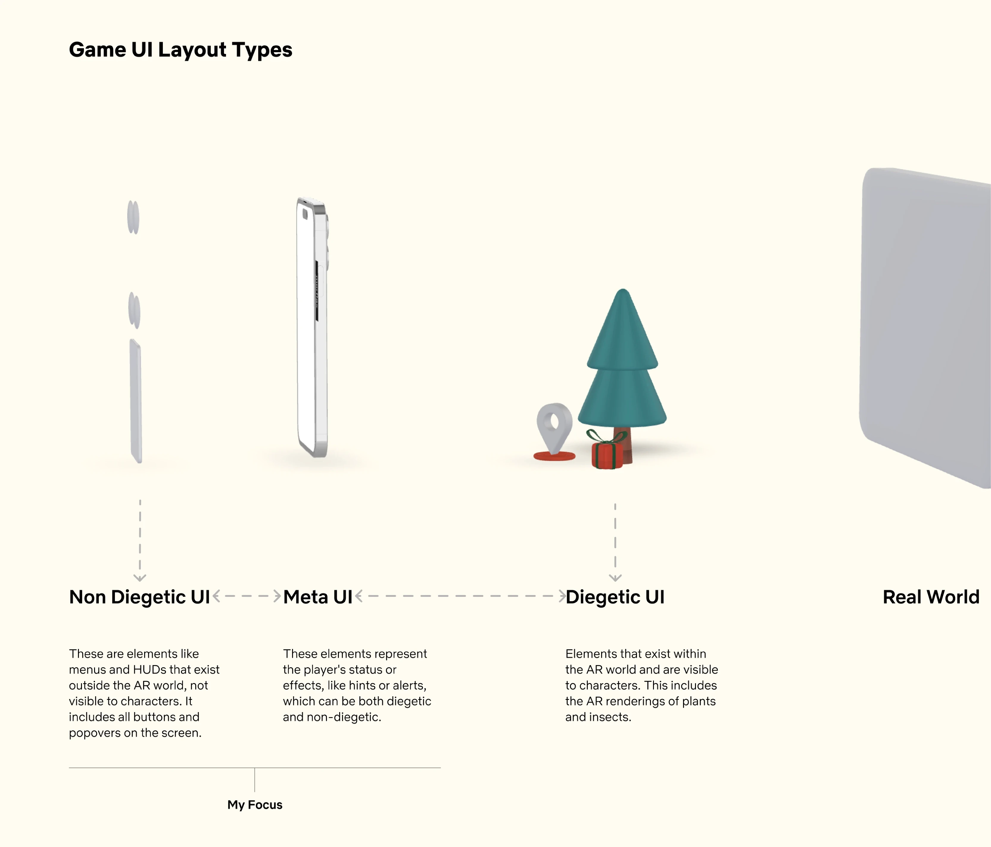
As the AR experience contains UI elements—both created using AR and integrated into the real world—these are categorized into four segments: Non-diegetic, Diegetic, Meta, and Spatial UI.
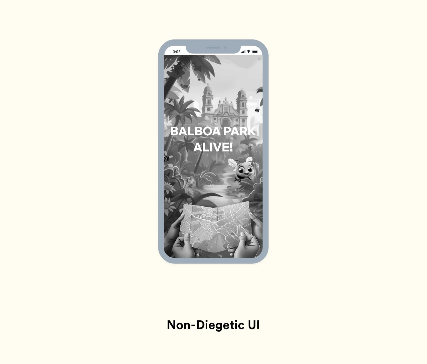
Non-diegetic UI: Elements like menus and HUDs that exist outside the game world, not visible to the characters (In our case, all the buttons, popovers that appear on the screen).
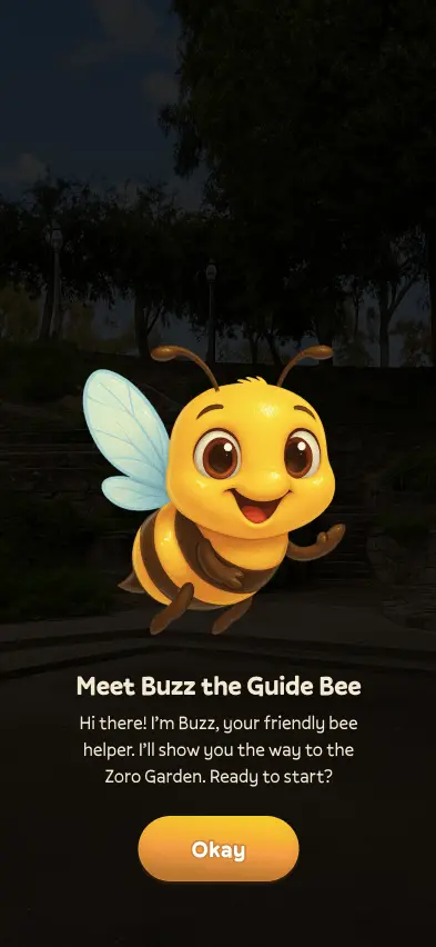
Diegetic UI: Elements that exist within the game world and are visible to the characters, like signs or in-game devices (In our case, the planting of seed, Plant, Pollinator Character).
Meta UI: Elements that represent the player's status or effects, like damage indicators or alert symbols, which can be both diegetic and non-diegetic (In our case, hints appearing on screen while planting seed and in general).
Spatial UI: Elements placed in the 3D space but not part of the game world, like waypoint markers or augmented overlays.
Blueprints
To explore some top-level layout arrangement decisions, I started by creating blueprints for the most important screen of the application—the AR Experience Screen, followed by other screens.
Blueprints over wireframes?
I chose blueprints over wireframes to test the layout arrangement because blueprints focus purely on spatial relationships and the placement of elements without getting into design specifics. This approach helps in making layout decisions by allowing for easy iteration and adjustment of the overall structure, ensuring the layout is functional and intuitive before moving on to more detailed designs.
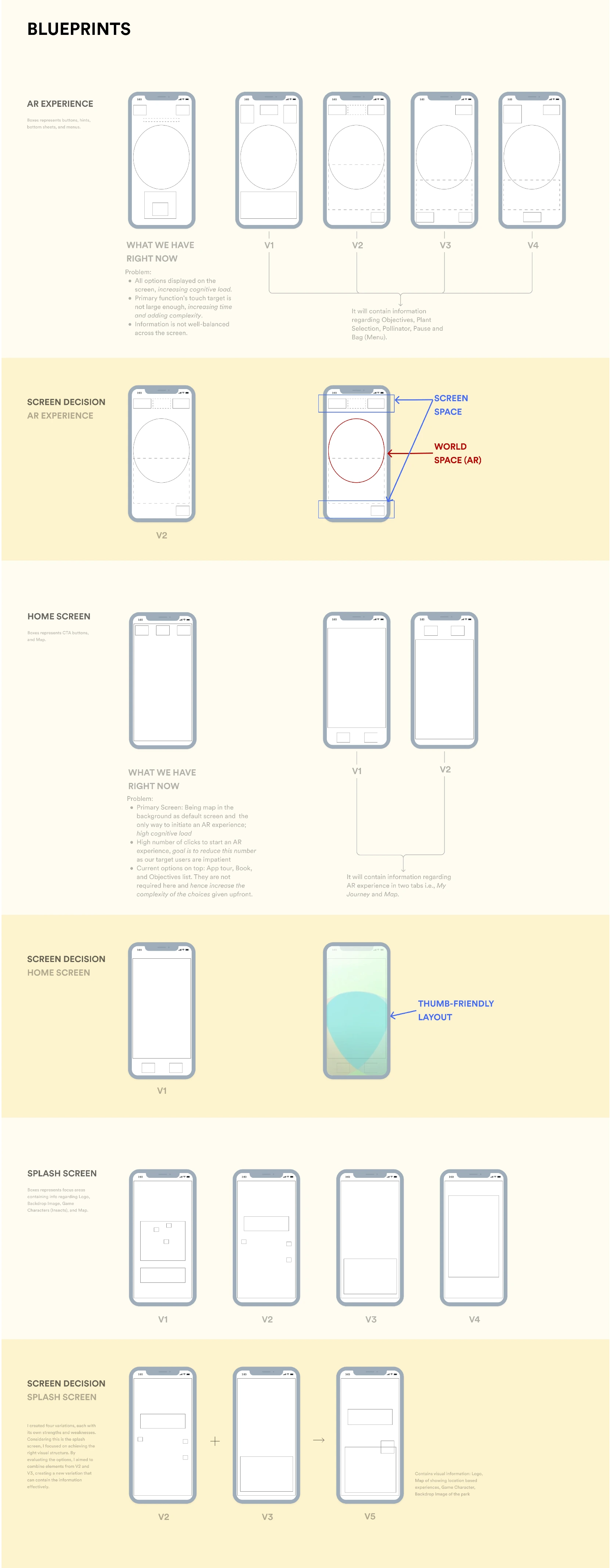
Low Fidelity Screens
These UI blueprints helped me visualize and evaluate different types of layout arrangements, giving a clear picture of where and how the information would be placed.
With that understanding, I moved on to creating low-fidelity mockups in Figma, refining the layout further.
AR Experience Screen
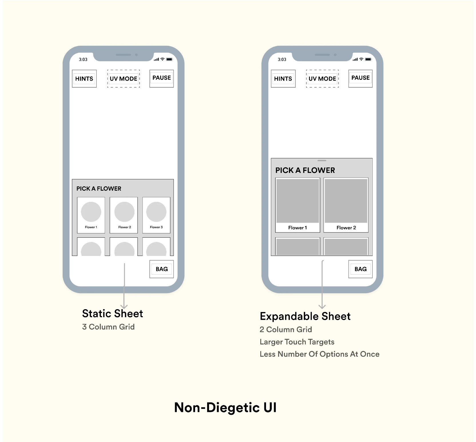
The first iteration has a static sheet that pops up to choose the flower and plant. It felt like the touch targets were small, especially on smaller screens. Based on my team's feedback, I iterated to make the touch targets larger and added a draggable component to make it collapsible. This also aligns with Fitts's Law, which suggests that larger touch targets are easier and faster to interact with.
Home Screen
Since the home screen serves as the launchpad for all location-based AR experiences, it needed to be both functional and easy to understand. The current version of the app only allows users to launch experiences by finding them on the map. However, I realized that our primary users, young kids, might feel overwhelmed with this UI. Therefore, I considered a two-tabbed navigation to present the same information in different visual formats. This also helped reduce the number of screens from four to just one, allowing users to launch the experience from My Journey with just one click if they are at that location.
One key UX principle that influenced my decision was Hick's Law, which states that the time it takes to make a decision increases with the number and complexity of choices. By providing two tabs—Map and My Journey—I simplified the decision-making process, reducing cognitive load. This approach ensures that users can easily navigate and find the AR experiences without feeling overwhelmed.
Splash Screen
The Splash screen is designed to create an engaging first impression while the app loads. I incorporated playful elements that hint at the AR experience awaiting users.
Visual Design
This app needs to have a degree of immersion that is heavily driven by usability and, hence, the UI. Since it is based in the Balboa Park region in San Diego, I took some pictures of the park and drew inspiration from nature itself.

This approach helped me develop a tonal palette with different colors. To ensure accessibility, I used the Adobe Color to test and select accessible color tones. I settled on brown as the primary color for the app, adding an earthy, warm feeling.
High Fidelity Screens
At this stage, I had my blueprints, color guide, and design system ready. What would the app look like in action? It was time to create high-fidelity screens.
AR Experience Screen
Objectives and Instructions
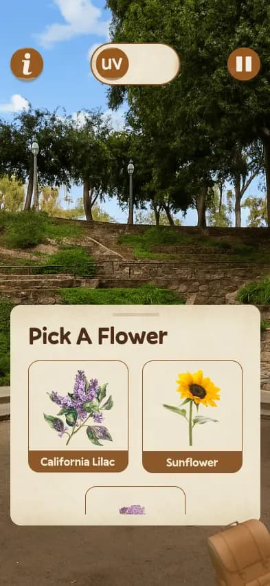
Plant Selection
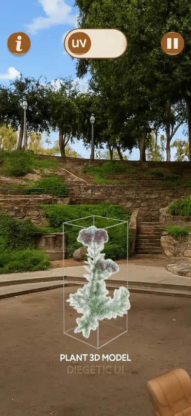
Seed Planting
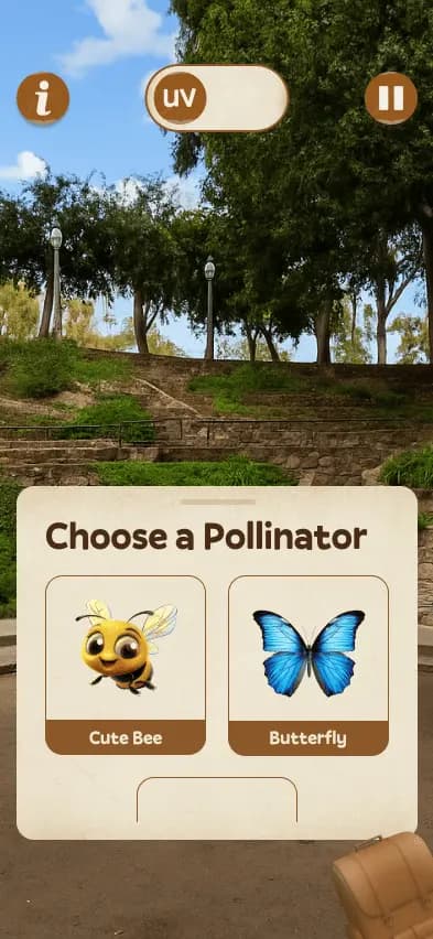
Pollinator Selection
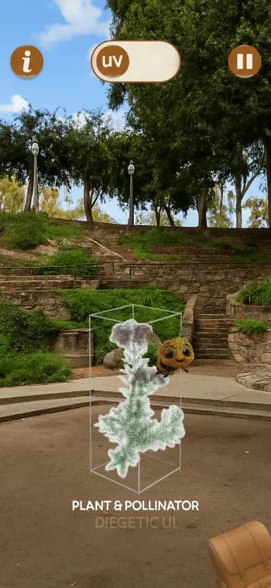
Plant & Pollinator Matching
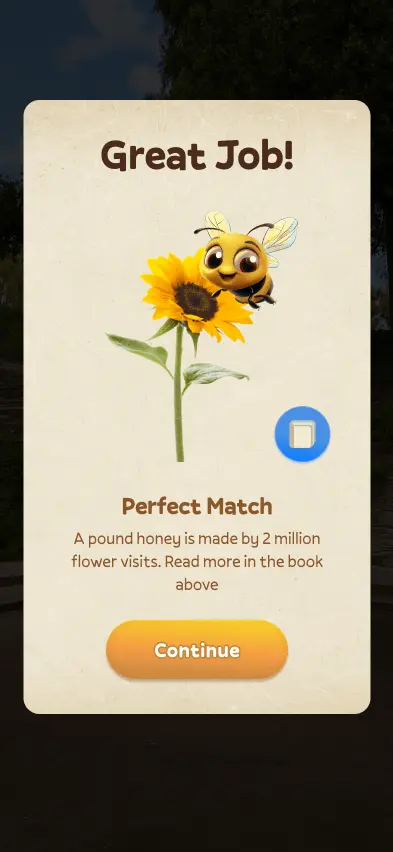
Match Popup
Experience Selection Screen
Initially, users found it challenging to select experiences using only the map. To simplify this, I created two ways to explore: the Journey tab, featuring a clear card-based list view, and the Map tab, providing a visual overview. Tapping "Start" guides users directly to their chosen location or initiates the experience if they're already there. I began with a static map, then enhanced the experience by integrating a custom-themed, real-time map using the Mapbox API.
Journey Tab (One Tap Start)
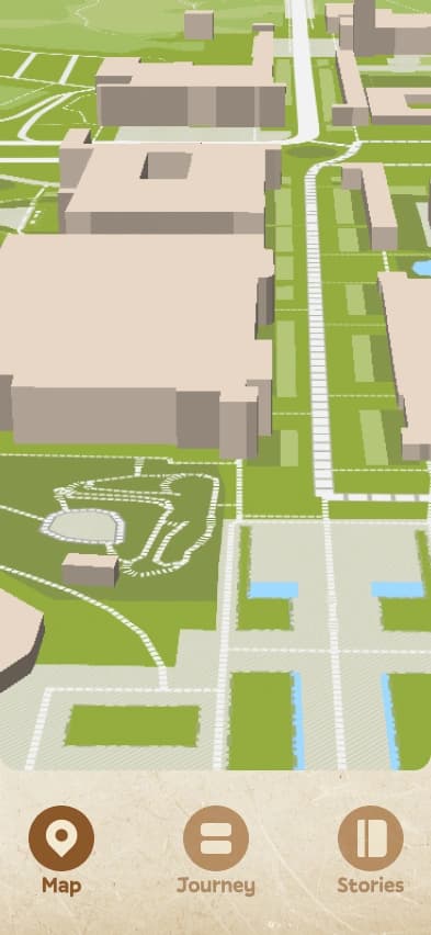
Map Tab
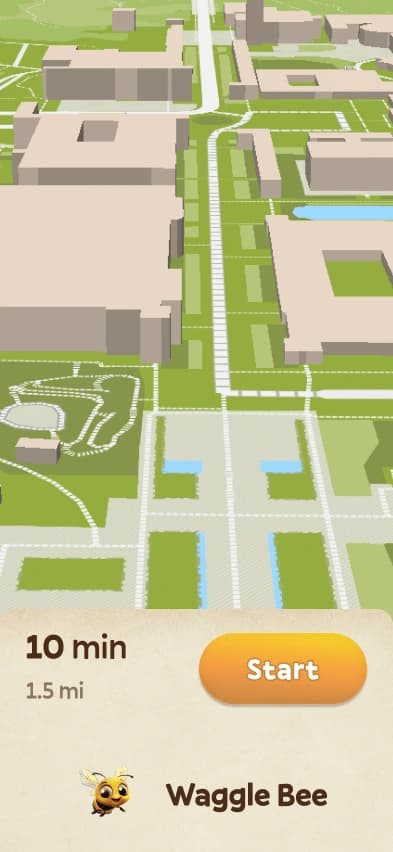
Experience Selected
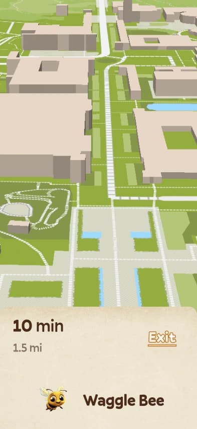
Experience Navigation Started
User has reached the Exp destination
Splash and Introduction Screen
Splash Screen
Welcome Screen
Journey
Map
Stories
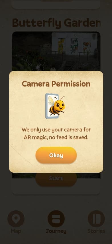
Permissions
Interactive Prototyping & Development
Since Figma has limitations and can't handle device sensors like cameras or custom scripts directly, I had to prioritize differently. Hand tracking was a key part, so I focused on that first to make sure the UI integration would be smooth later on. Working closely with the dev team, We used MediaPipe library to set up real-time hand tracking and gesture recognition. Once We got the basic system working, we connected hand movements first with simple game objects, and then with full 3D models.
Hand Tracking: Gesture Recognition (MediaPipe)
Testing Hand Tracking
Navigating with Bee
Seed Planting
Pollination
Pollination
Free Plant Mode
UV Vision
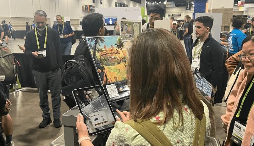
Demo and Accolades (SIGGRAPH, Harvard, and MobiSys)
ACM SIGGRAPH '24
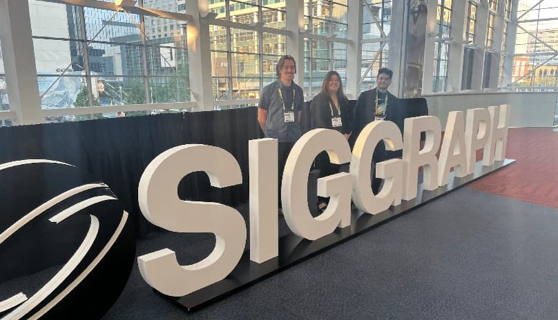
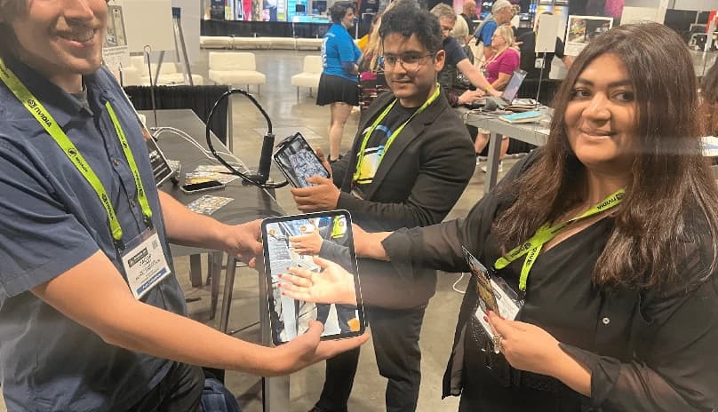
I was selected along with my team to present our project at the SIGGRAPH '24 conference, the premier event for computer graphics and immersive technologies worldwide. During the conference, I successfully showcased the project to around 100+ attendees. Additionally, we leveraged this opportunity to test our app's usability, gathering valuable feedback and insights from the audience.
HarvardXR '25 (Harvard University)

ACM MobiSys '25
Press & Coverage
SIGGRAPH 2024
Our paper titled 'Balboa Park Alive: Exploring Biodiversity through AR' was accepted and presented in Appy Hour.
Harvard University
Our project was showcased at HarvardXR 2025, a conference focused on AI, XR, CGI, Metaverse, Virtual Art, and more.
ACM MobiSys 2025
Published in ACM MobiSys 2025, a conference focused on mobile systems, algorithms, and networks in demo category.

SIGGRAPH 2025 Blogs
Discover how this AR app brings biodiversity to life, turning nature into an adventure that sparks curiosity and environmental action.